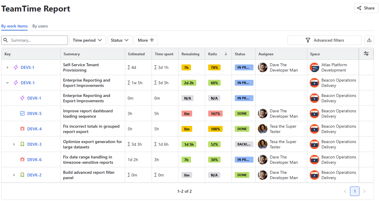
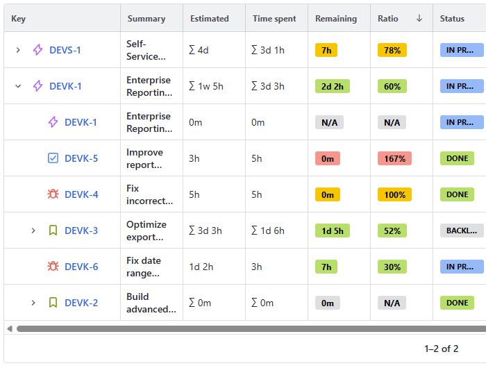
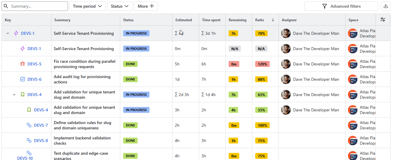
The data grid is where your report results come to life. It is designed to be highly interactive, allowing you to organize, sort, and filter your metrics to find exactly what you need.
Data grid structure
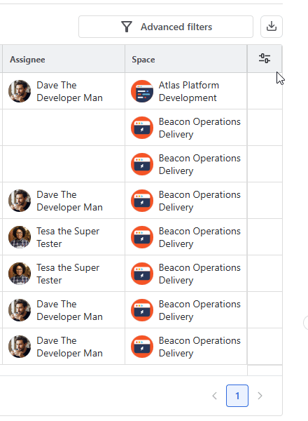
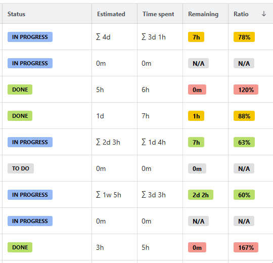
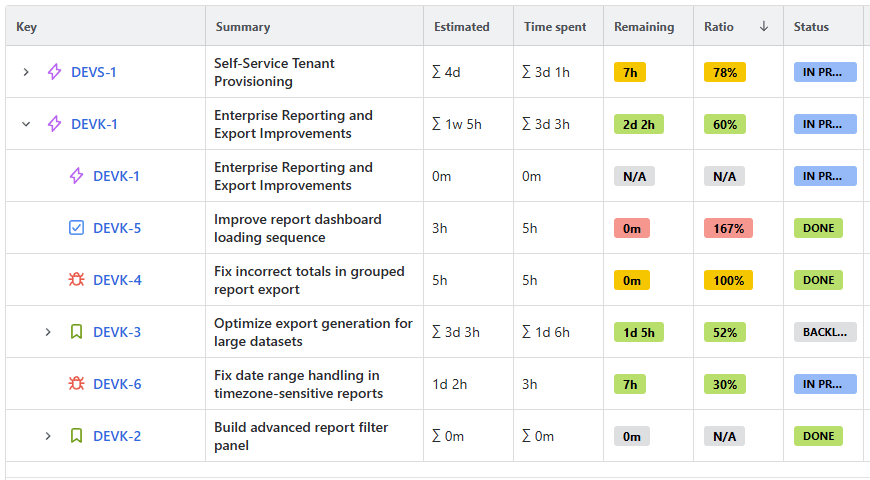
The grid displays standard Jira details (Key, Summary, Status, Assignee, Space) alongside specific app metrics:
-
Estimated Time
-
Time Spent
-
Remaining Time
-
Ratio (Percentage of the estimate already consumed by logged time).
Viewing Modes
By work items (Default)
Currently, data is organized by individual work items, with child items grouped neatly under their top-tier parent.
By users
Controlling the grid
Customizing columns
You can add or remove columns to simplify your view by clicking the Configuration button in the top-right corner of the grid.
You can also change the position of the columns as you check your report simply by dragging one of the columns onto a new spot:
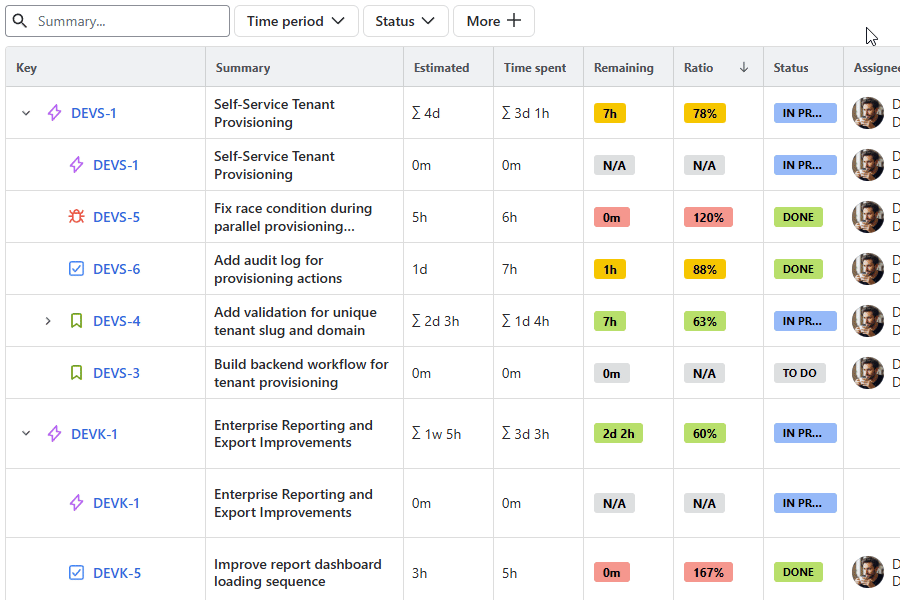
Sorting data
By default, the grid is sorted by Ratio in descending order. However, you can sort by any column header:
-
First click on the header: Sorts ascending (Arrow Up icon).
-
Second click on the header: Sorts descending (Arrow Down icon).
-
Third click: Clears the sort and returns to the default state.
Tip: Clicking a new column header will automatically reset any active sorting on a previous column.
Pinning columns
If your report has many columns, you can pin important ones to keep them visible while you scroll horizontally.
To pin a column, hover over the header of the column you wish to pin and click the dropdown button next to the sorting icon.
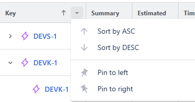
Select Pin to left or Pin to right.
The column will move to the edge of the table and remain static as you scroll through other data points.
You can choose to unpin the column in the same menu later for a different configuration.
Filtering the data
To narrow down your results, you have three layers of filtering located above the grid.
Summary Search
Enter any text into the search field above the left corner of the grid. The grid will dynamically update to show only work items with matching titles. If no items are found, the grid will display the message, No work items were found matching your search.
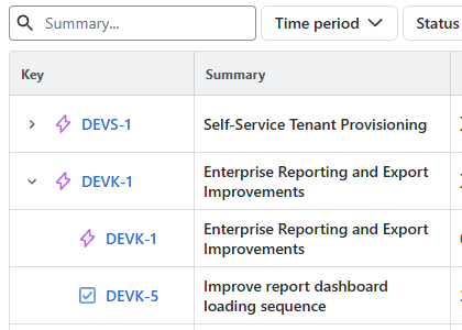
You can click the ✖️ button to clear out the search field.
Quick Filters
These are buttons located at the top of the data grid for fast access to common parameters.
You can customize the filter panel by clicking the More + button to open the filter menu. Check or uncheck boxes to choose which filters remain pinned above your grid.
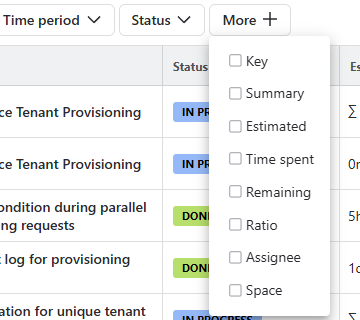
To use them, click any filter to select your parameters.
Special guest: Time period Quick filter
The Time period filter is designed to always be above the data grid. It allows you to isolate specific timeframes. However, it is important to understand how this filter interacts with your metrics, as it changes the nature of the report.
Option 1: Specific time range: If you set the filter to a specific range (e.g., October 1st to October 31st), the grid will only display work logged within those specific 31 days.
-
What it shows: The velocity or effort of your team during that window.
-
Best for: Monthly billing, payroll, or seeing which tasks were the focus of a specific sprint.
-
Metric impact: The Time Spent will only reflect hours logged in October.
Option 2: Up-to-a-certain-date, or Lifecycle:
If you want to see the current status of a project as of the end of a month, you should set your start date to the beginning of the project (or leave it open) and set the end date to the last day of that month.
-
What it shows: The total health of the project up to that point.
-
Best for: Budget tracking and project management.
-
Metric impact: This includes all work done before that month plus the work done during it. This is how you see the true Remaining Time and Ratio.
Advanced Filters
For complex queries across multiple columns with more defined parameters, use the Advanced Filters button.
Inside the Advanced filter window, click Add Filter to define specific criteria. This will also pin a corresponding Quick filter above the grid for future use.
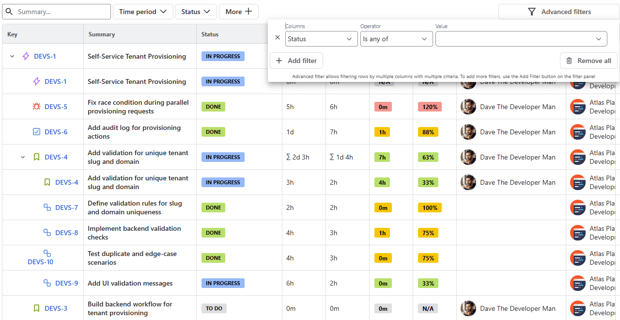
Synchronization: Quick and Advanced filters are fully synchronized. Any change made in one will automatically update the other, eliminating the chance of any conflicts.
Note: Clearing your Advanced Filters will also reset the Quick Filters panel to ensure your view is completely refreshed.
Stay informed
Subscribe to get the latest updates and explore new product capabilities